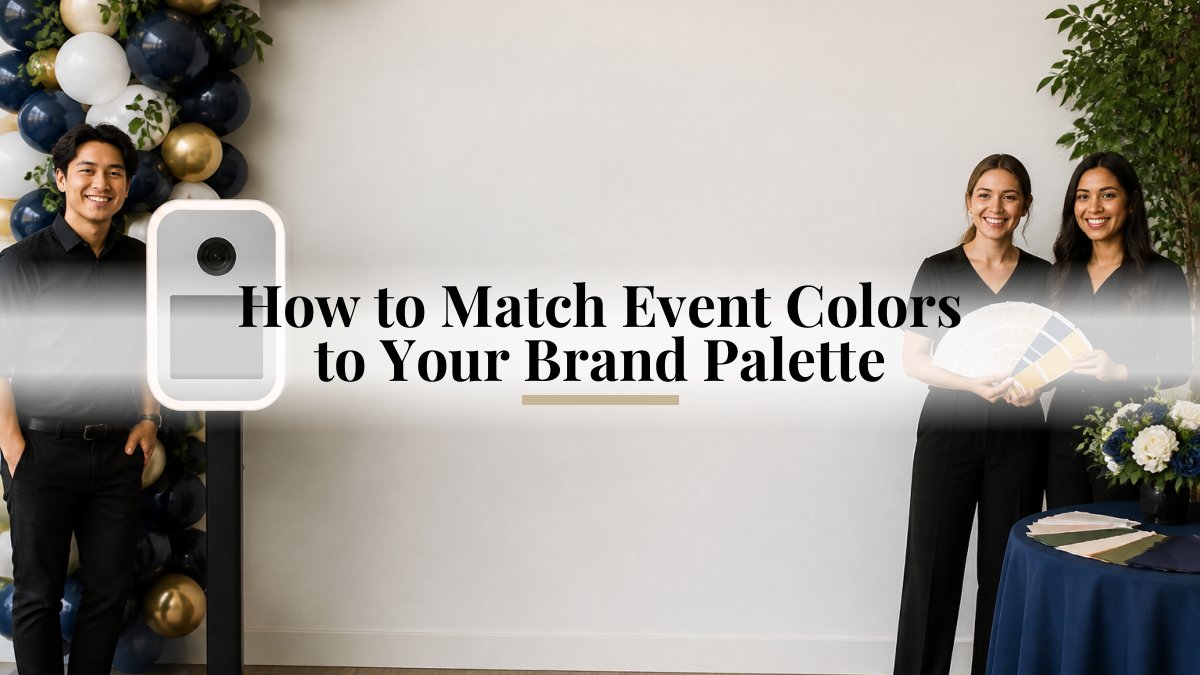
How to Match Event Colors to Your Brand Palette
Last Updated: October 28, 2026
Quick Summary
To match event colors to your brand palette, first define which colors your brand owns: a primary color, a secondary color and an accent color, each with a clear job. Then audit every place your brand appears, map each color to specific event elements and venue surfaces, and share the approved values with every vendor.
- Assign each brand color a role: primary, secondary or accent.
- Audit logos, website, packaging and past signage to find color inconsistencies.
- Record HEX, RGB and CMYK values together so vendors use identical numbers.
- Give no event element more than two brand colors, and include a neutral.
- Test colors on the venue's surfaces and lighting, and get a physical print proof.
Table of Contents
- Start With Your Brand Palette: Primary, Secondary and Accent Colors
- Step 1: Audit the Brand Colors You Already Use
- Step 2: Map Brand Colors to Event Elements and Venue Surfaces
- Step 3: Use a Corporate Event Color Palette Built From Brand Colors
- Step 4: Build the Palette With an Event Color Palette Generator
- Step 5: Carry Brand Colors Into Decor and Lighting Without Overdoing It
- Step 6: Apply the Palette to a Branded Photo Booth Template
- Check Contrast and Readability in Print and Digital Materials
- Common Mistakes When Matching Event Colors to Your Brand
- Book Your Branded Photo Booth With Your Palette Ready
- Frequently Asked Questions
Start With Your Brand Palette: Primary, Secondary and Accent Colors
Matching event colors to your brand palette starts with knowing exactly which colors your brand owns. Most brands use three roles: a primary color that carries the identity, a secondary color that supports it, and an accent color used sparingly for emphasis. Events can look polished when they begin with this clear division.
Think of the palette as a set of jobs rather than a list of swatches. The primary color appears most often and anchors the event. The secondary color fills large areas like walls or tablecloths. The accent color draws the eye to a single point, such as a logo wall or a print template.
Before you plan anything else, write down each color's role. Keep the list short.
Step 1: Audit the Brand Colors You Already Use
Your brand already uses colors in many places, and those places are not always consistent. A logo may use one shade of blue, while the website uses a slightly brighter version and the slide deck uses a grayer one.
Start by collecting every place your brand shows up:
- Logo files and brand guidelines
- Website buttons, headers and backgrounds
- Product packaging and printed materials
- Email templates and social media graphics
- Past event signage and booth prints
Compare them side by side. Note any colors that do not match. A small drift in shade can make an event look off-brand.
Once you find the official values, record them. Keep the HEX codes, RGB values and CMYK values together so your vendors can use the same numbers.
Step 2: Map Brand Colors to Event Elements and Venue Surfaces
Not every brand color works on every surface. A bright accent may glow on a dark backdrop but disappear on a white ballroom wall. The fix is to assign each color a job before you commit to a single vendor order.
Build a mapping sheet with four columns: event element, color role, surface or material, and the vendor who owns it. Here is a working example you can adapt:
| Event element | Color role | Surface or material | Owner |
|---|---|---|---|
| Step-and-repeat wall | Primary | Printed vinyl or fabric panel | Backdrop vendor |
| Stage drape | Primary and neutral | Velour or polyester drape | AV or drape vendor |
| Guest tables | Secondary | Linens, runners, chargers | Rentals vendor |
| Florals | Secondary and accent | Blooms, ribbon, vessels | Florist |
| Wayfinding and directional signs | Accent on neutral | Foam board, acrylic, or cardstock | Signage printer |
| Registration and check-in desk | Primary and neutral | Printed wrap or linen | Rentals or print vendor |
| Photo booth backdrop and template | Primary and accent | Printed panel and digital overlay | Photo booth team |
| Digital assets (invites, reminder emails, event app) | Primary and accent | Screen | Marketing team |
Two rules keep the sheet honest. First, no element gets more than two brand colors. Second, every element must include at least one neutral so the brand color has contrast to sit against. A table that is primary plus secondary plus accent with no neutral can look busy in photos.
Venue surfaces change how a color reads, and in this market they change what you can even install. Dark carpet, exposed brick, mirrored walls and warm house lighting can affect how brand colors appear. Ask the venue for photos of the room under event lighting, or walk it during a comparable event if you can.
NYC venue logistics belong on this sheet too, because they decide which elements are even possible:
- Hanging restrictions. Confirm what can be hung and how before you spec a backdrop.
- Freight elevators and loading docks. Ask for freight elevator dimensions and the loading dock window, and note the door width on your sheet.
- Certificate of insurance. Collect any required COIs early.
- Load-in and strike windows. Tight windows make it important to confirm setup and strike logistics with your vendors.
Once the sheet is filled in, read it top to bottom. If the primary color appears on more than half the rows, consider using it on fewer elements. Everything else can lean neutral.
Step 3: Use a Corporate Event Color Palette Built From Brand Colors
A corporate event color palette should be built from the brand palette, not invented from scratch. The goal is to stay recognizable while giving the event its own energy.
Start with the primary brand color as the base. For backdrop options that can carry your palette, see photo booth backdrops for NYC events. Add one neutral, such as white, charcoal or warm gray, so the brand color has room to breathe. Then choose one secondary and one accent from the brand set.
This gives you a palette of four or five colors that feels intentional. Avoid adding new hues from outside the brand unless the event theme requires them. If a seasonal or holiday theme calls for extra color, limit it to one or two supporting shades and keep the brand colors in the most visible spots.
A good test is to imagine a guest's photo. The brand color should appear in the frame and still feel like the brand.
Step 4: Build the Palette With an Event Color Palette Generator
A color palette generator can speed up the process, especially when you need a few supporting tones that work with your brand colors. Some color palette generators let you enter a HEX code and suggest related colors.
Use the generator as a starting point, not the final answer. Follow these steps:
- Enter your primary brand HEX code.
- Generate a set of related shades, tints and tones.
- Pick one neutral and one supporting color that match the event mood.
- Check each choice against your brand guidelines before you use it.
- Save the final HEX codes in a shared document for every vendor.
Because generators vary, double-check the output on screen and in print. A color that looks right on a monitor can appear different in print.
Step 5: Carry Brand Colors Into Decor and Lighting Without Overdoing It
Decor carries most of the color in an event, so start there. Use the primary brand color for large areas like backdrops and draping. Use the secondary color for tables and chair covers. Save the accent color for small details such as napkins, signs and printed strips.
Lighting can help or hurt the palette. Warm light can push brand blues toward gray, and cool light can make reds look harsh. Ask your lighting vendor to test the main brand colors in the actual venue.
The most common error is overdoing it. When every surface uses the brand color at full strength, the room feels heavy. Mix in neutrals so the brand colors stand out.
Step 6: Apply the Palette to a Branded Photo Booth Template
Your photo booth is one of the most visible places for brand colors, because guests take the prints home and share the digital images. A branded photo booth template should carry the palette in a consistent way.
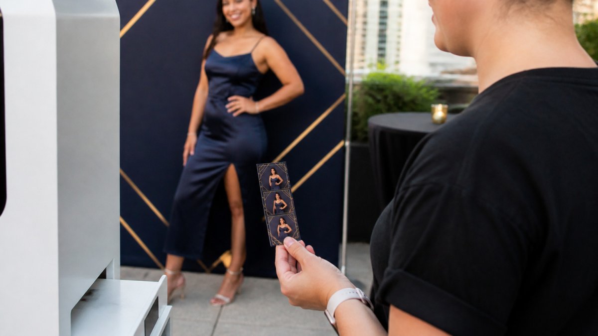
Use the primary color for the main border or background. To see how custom branding is incorporated into event photo booth prints, read how to incorporate custom branding into event photo booth prints. For a broader look at matching booth decor to your event's colors and styling, see how to match booth decor to your event. Place the logo in a clean area with enough contrast. Use the accent color for a headline or event name. Keep text legible and avoid placing small type over busy patterns.
Photobooth NYC booths include custom-branded print templates, so you can carry your palette into your prints. If you are weighing booth formats, the Signature Photo Booth Package offers 2x8 strips or 6x8 prints.
Here is a simple template checklist to share with your designer:
- Primary color used for the main background or border
- Secondary color used for supporting elements
- Accent color used for one headline or highlight
- Logo placed with clear space around it
- Text readable at print size
Check Contrast and Readability in Print and Digital Materials
Contrast affects whether your palette is readable. Light text on a light background can be difficult to read on a printed strip, and dark text on a dark backdrop can be difficult to see in photos. Check every combination before you finalize the design.
For digital materials, check that text stands out against its background on both bright and dim screens. For print, ask for a physical proof. Colors can look different on paper than on screen.
A simple habit helps: view each design at a small size, as a guest would on a phone, and again at poster size. If the message or logo is hard to read at either size, adjust the contrast.
Accessibility matters too. Some guests may have difficulty distinguishing certain colors. Pair color with text labels or shapes so information does not depend on color alone.
Common Mistakes When Matching Event Colors to Your Brand
Palette problems at events can arise during handoffs. A color may look different on drape than in brand guidelines, or vendors may use different versions of the same color. Here are some potential handoff issues and ways to address them.
Mistake 1: Sending one color format to every vendor. Ask each vendor which color formats they prefer and confirm they received them.
Mistake 2: Approving color on a screen only. Consider requesting a physical proof of printed elements that carry a brand color, such as signage and a step-and-repeat.
Mistake 3: Assuming the venue's lighting is neutral. Ask the venue what the room's event lighting looks like and, where possible, view your printed proofs under similar conditions. Plan decor colors with the venue's lighting in mind.
Mistake 4: Letting each vendor pick their own shade. For practical tips to compare against your plan, see corporate event photo booth branding tips. Assign one person to approve color decisions, and put the approved values in a single shared document for vendors.
Mistake 5: Skipping the photo test. Before you sign off, look at the palette through a phone camera in the actual or similar lighting.
Mistake 6: Forgetting accessibility. Some guests have color blindness, which makes red and green hard to distinguish. Never let color alone carry meaning on signage or registration materials; pair it with text labels or shapes.
A simple handoff checklist prevents most of these:
- Brand color values recorded
- One named color approver on the planning team
- Printed brand elements reviewed
- Venue lighting considered during planning
- Palette reviewed in event photos
- Accessibility check on signage and registration materials
- Final color document shared with every vendor, including the photo booth team
Avoiding these mistakes matters more than choosing the perfect color.
Book Your Branded Photo Booth With Your Palette Ready
When you have your primary, secondary and accent colors, you are ready to plan a branded photo booth experience. For corporate events, the Corporate Event Photo Booth Rental and the Branded Photo Booth for Brand Activations are relevant options.
Photobooth NYC serves Manhattan, Brooklyn, Queens, Staten Island, Nassau County and Suffolk County, with fully attended booths for corporate events, brand activations and private celebrations. Check availability for your date. For planning help, see the Manhattan event photo booth guide for hosts.
Frequently Asked Questions
How do you choose colors for a corporate event?
Start with the brand's primary color and two supporting colors from its existing guidelines, then decide which of those will carry the event. Use the primary color for the most visible surfaces such as signage, step-and-repeat backdrops and printed templates. Reserve the accent color for small highlights like table numbers and guest-facing details. Test the choices on the actual venue lighting and materials before you finalize, because colors can look different across settings.
How many colors should an event palette include?
A palette might include one dominant brand color, supporting colors and an accent. Consider how the colors will appear across décor, signage and printed materials.
How do you apply brand colors to a photo booth template?
A template can use the primary color for the frame or header, the accent color for event details and a neutral background. Consider how the colors will appear in print and digital images.
How do you keep brand colors from making an event feel overly branded?
Use brand colors as the structure of the room and let the event theme and guest experience carry the personality. Apply the primary color to a few anchor surfaces, use secondary colors in florals and linens, and keep the accent color for details.

